 Screenshot Maker
Anatomy of a Fake Facebook Post Screenshot (And How to Build One)
Most "fake Facebook screenshot" tutorials start with a tool tour. This one starts with the post itself, because a Facebook feed card is a stack of parts. If one part is from LinkedIn and another is from Instagram, the PNG fails even if the blue header is right.
Below is the anatomy. After that, how to put the same parts into Screenshot Maker's Facebook post template.
Author row
Facebook leads with a person or a Page name, an avatar, and a relative time (3h). "Alex Rivera" plus a face is a personal post. A Page name plus a logo is a brand post. Mixing a personal-looking name with a corporate paragraph in the body is a common mismatch.
Do not put @handles in this row. That is X or Instagram. Facebook display names are names.
Timestamp
3h and 2d read native. August 18, 2026 at 4:02 PM can be real Facebook too, but in a compact mock it often looks like you exported from a debugger. Match the rest of the card: a casual body wants a short relative time.
Body text
This is the status. One or two sentences. Launch energy is fine ("Excited to share what we've been building — launch week starts Monday") if it sounds like something a person would still post in 2026. A feature list with bullets belongs on a website, not in this field.
Line breaks: one is enough. A wall of whitespace looks like a CMS dump.
Image
Optional in real Facebook, almost required in a marketing screenshot. A text-only post can look like a notification. For product work, add the image in the editor so the card has the same weight as a real share.
The image should agree with the body. A sunset with a B2B launch paragraph is a slideshow accident.
Reactions, comments, shares
Facebook shows a reaction summary (1.2K), comments, and shares as separate counts. They should be same-universe numbers. A post with 26 shares and 84 comments and 1.2K reactions is a normal shape. 1.2K shares and 12 comments is weirder, unless you are simulating something that got forwarded in Groups.
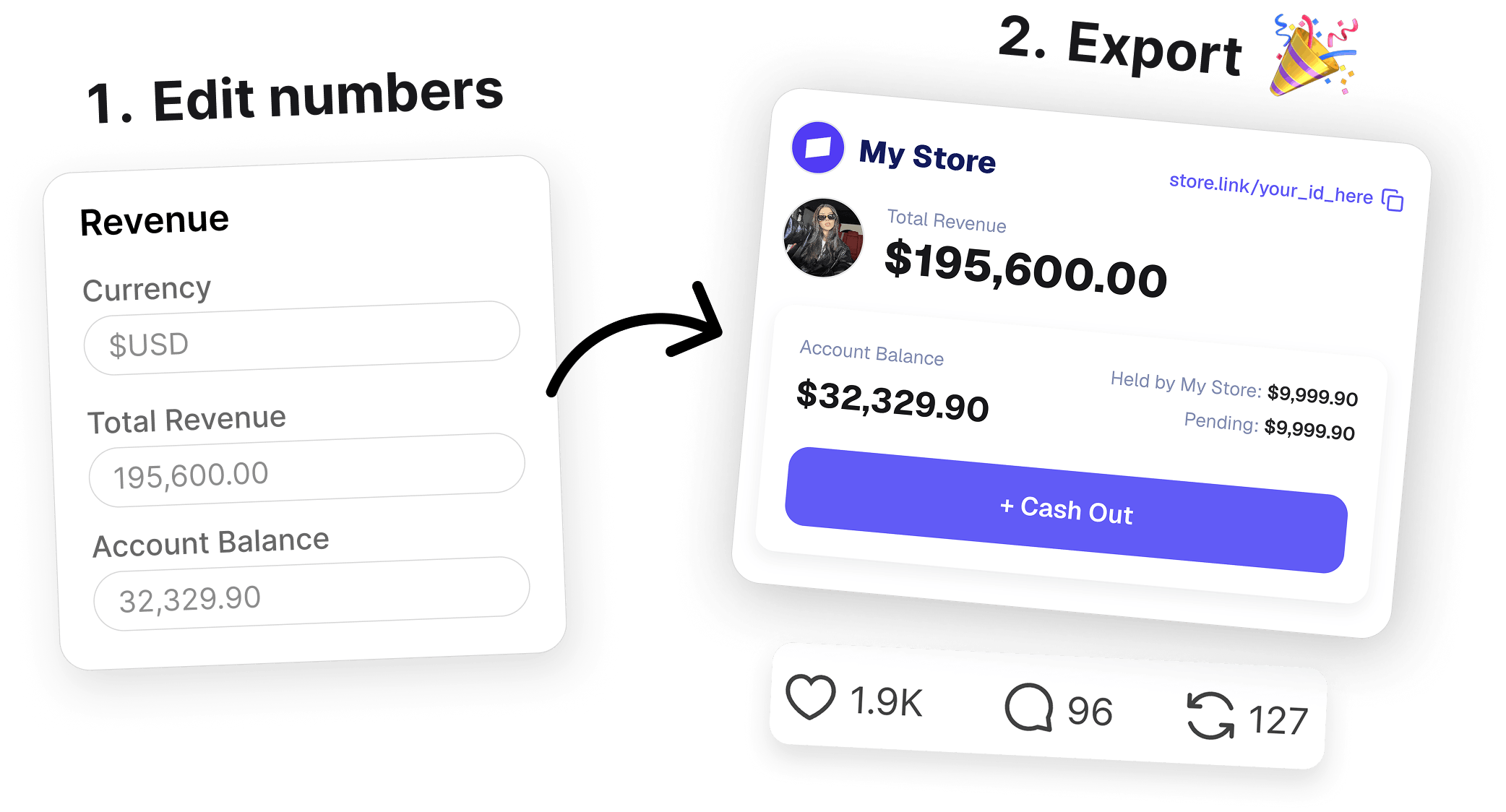
Create a screenshot to get more engagement.
Pick a template, edit the numbers, and export.
Start FreeInstagram-style "likes" wording does not belong on this card.
Putting the anatomy in the generator
Open social-facebook-post. Map 1:1:
authorName→ author rowpostedAgo→ timestampbody→ statusimageDataUrl→ photoreactions/comments/shares→ footer counts- avatar optional but recommended
Preview at phone width. Facebook screenshots in ads are usually a phone crop, not a full desktop News Feed.
Create a screenshot to get more engagement.
Pick a template, edit the numbers, and export.
Start FreeExport PNG. Crop extra UI if your ad unit is square.
Where teams actually use this
| Use | Why Facebook chrome |
|---|---|
| Older-demographic paid social | They still read this feed |
| Community / local business story | Pages and Groups live here |
| "Share this announcement" in a deck | Familiar blue/white card |
If the customer is on Reddit, do not force Facebook. Use Reddit. If they only care about the grid, use Instagram post. Chat-style proof is Messaging, not this template.
You now have the parts named. Build the card in the Facebook post editor in one pass instead of redesigning News Feed from scratch.